Designing AI Agent Approval Screens Reviewers Actually Read
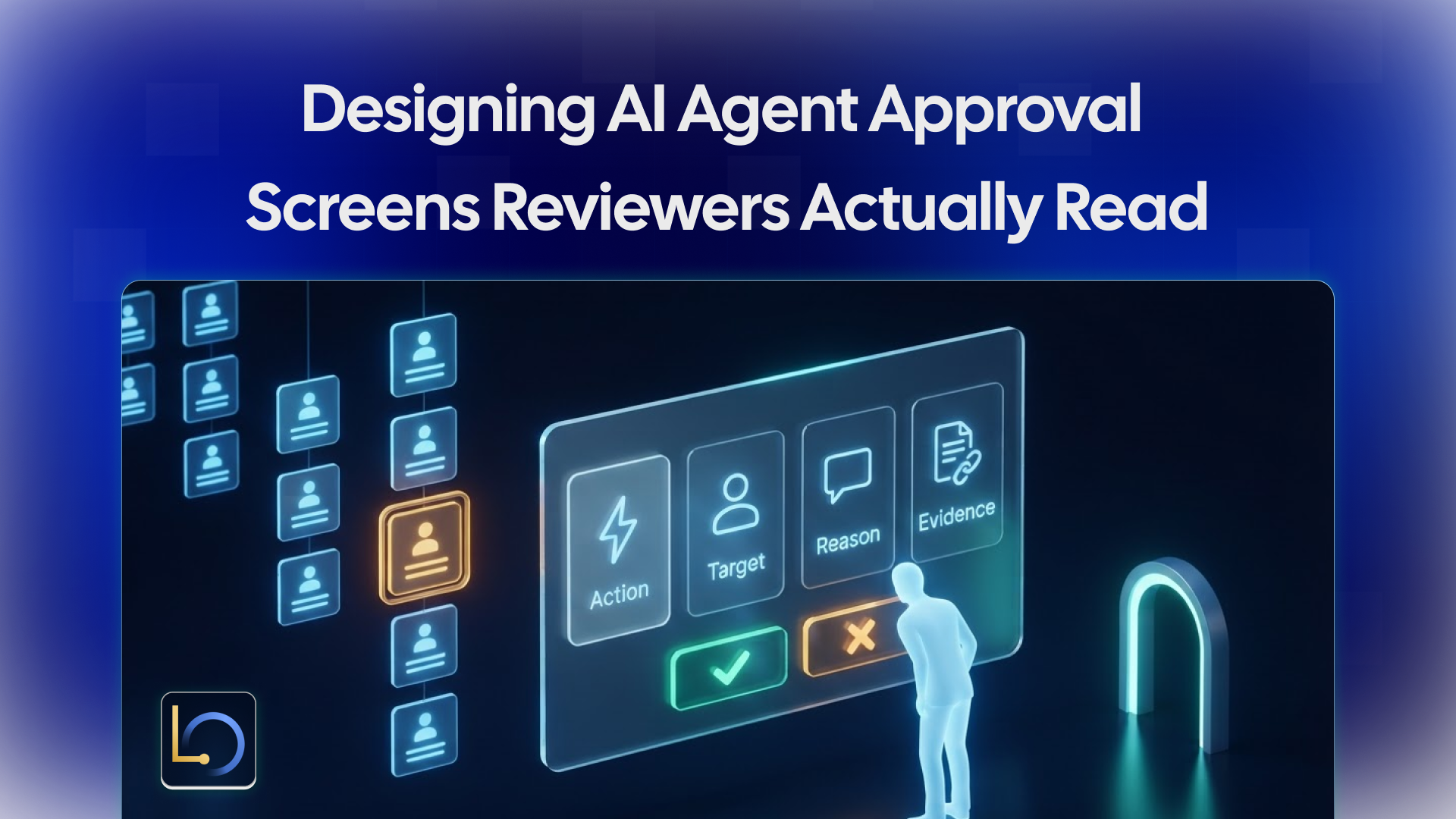
Putting a person in the loop is one of the best safeguards for an AI agent. Before the agent sends, spends or changes something, it stops and asks. But an approval point only protects you if the person actually reads what they're approving.
In practice, many don't. The screen shows a vague summary, the queue is long, and after the fortieth harmless request the forty-first gets approved on reflex. The safeguard is still there on paper, but it has stopped working. This guide covers why reviewers stop reading, what an approval screen should show, design patterns that keep attention where it belongs, and the rules that belong behind the screen rather than on it.
Why reviewers stop reading
Rubber-stamping is rarely laziness. It's what people do when the screen and the volume make careful reading impractical:
- Too many approvals. If every lookup and draft needs a click, approvals become noise, and the risky one hides among hundreds of harmless ones.
- Too little context. "Approve refund?" with no amount, no reason and no source gives the reviewer nothing to judge, so they trust the agent.
- Too much text. A wall of conversation history buries the one line that matters.
- Everything looks the same. When a $5 credit and a $5,000 refund share one layout, the big one gets the same quick click.
- No cost to clicking yes. If approving is one click and declining needs a written reason, the screen nudges people toward approving.
Each of these is a design problem, which means each has a design fix.
What every approval screen should show
A reviewer should be able to make a good decision in under a minute without leaving the screen. That takes five things, in this order:
The last row matters more than it looks. If an action traces back to text inside a document or a ticket, rather than to a person's request, the reviewer should see that. It's the clearest warning sign of an instruction hidden in content, also known as prompt injection.
Show the action first and in plain words. The evidence supports the decision; it shouldn't be the first thing a reviewer has to dig through.
Design patterns that keep reviewers reading
- Gate side effects only. Reading and drafting run freely. Only actions that send, spend or change something reach the queue, so each approval means something.
- Show the change, not the conversation. For record updates, show before and after side by side. For messages, show the exact text that will be sent.
- Make risk visible. Larger amounts, new recipients and irreversible actions should look different: a different color, an extra line, a second confirmation for the highest tier.
- Make declining as easy as approving. One click each. Offer an optional reason with a few common choices, so declines also teach you where the agent goes wrong.
- Let reviewers edit before approving. If a drafted message is almost right, fixing one sentence beats declining and starting over.
- Group similar requests carefully. Batching ten small, identical credits saves time; batching mixed actions hides the odd one out.
- Say what happens next. "Approving issues the refund now; the customer is notified" removes doubt about what the click does.
- Watch the queue. Track how long approvals take and how often each reviewer declines. Approvals in a couple of seconds, all day, are a sign the screen has stopped working.
Behind the screen: what the UI can't enforce
A good screen helps people decide well. It can't, on its own, make the decision binding. Some rules have to live in the system behind it:
- Only approved actions run. Approval must be the only path to the action. If a retry, a background job or another code path can perform it anyway, the button is decoration.
- Declined means never. A declined action shouldn't come back through a retry or a slightly reworded proposal.
- The requester doesn't approve. The person who asked for an action shouldn't be able to approve it, and each reviewer needs their own identity so "who approved this?" has an answer.
- Every decision is recorded. What was proposed, who decided, when, and what happened next.
In LibraOS, permissions, approval points and audit are configured for the tasks your app runs through the Runtime; tools, shell commands and network activity outside the Runtime need their own enforcement. The approval screen is your app's job; making sure every side effect actually passes through it is the part to verify before launch.
Common mistakes
- Asking for approval on reads and drafts, so the real decisions drown.
- Showing a summary without the amount, the recipient or the evidence.
- Pasting the whole conversation instead of the change.
- Making decline slower than approve.
- One shared reviewer account.
- A button that isn't the only path to the action.
Checklist
- ☐ Only actions that send, spend or change something need approval.
- ☐ Each screen shows the action, the target, the reason, the evidence and the source of the request.
- ☐ Changes are shown as before and after; messages as the exact text.
- ☐ Higher-risk actions look different.
- ☐ Approve and decline take the same effort.
- ☐ Reviewers can edit a draft before approving.
- ☐ Requesters can't approve their own actions; each reviewer has their own identity.
- ☐ Approval is the only path to the action, and declined actions never run.
- ☐ Decision times and decline rates are tracked.
Conclusion
An approval point is only as strong as the attention it gets. Keep the queue for actions that matter, show each one with its target, reason, evidence and source, make risk visible, and make declining as easy as approving. Then make sure the system behind the screen does its part: approval as the only path to the action, declines that stick, separate requesters and reviewers, and a record of every decision.
Explore LibraOS: libraos.com
Sources
What’s Next?
Sign up and explore now.
🔍 Learn more: Visit our blog and documents for more insights or contact us for a demo of how MegaNova can power your AI products.
📬 Get in touch: Join our Discord community for help or Contact Us.
Stay Connected
💻 Website: meganova.ai
📖 Docs: docs.meganova.ai
🎮 Discord: Join our Discord
👽 Reddit: r/MegaNovaAI
𝕏 X: @meganovaai